« Welcome
to this
loving world »
How to solidify a high quality and premium status for a chinese baby textile brand?
As a brand belonging to the Little Star group, starting from a successful sleeping bag company to a Chinese leader brand 20 years later, Yeehoo keeps on researching and releasing new products and services for children aged 0 to 6, progressing, innovating and exploring to maintain its iconic brand status on the market.
In 2014, as the brand was coming to its 20th anniversary, Little Star entrusted BETC Design to rebuild Yeehoo’s brand strategy, in order to emphasize the brand’s emotional value, and to embody this new concept via a new visual identity and therefore be closer to the consumers.
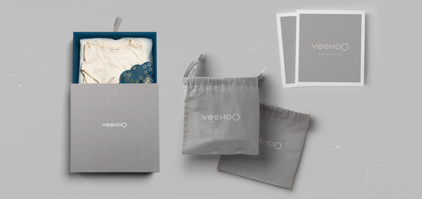
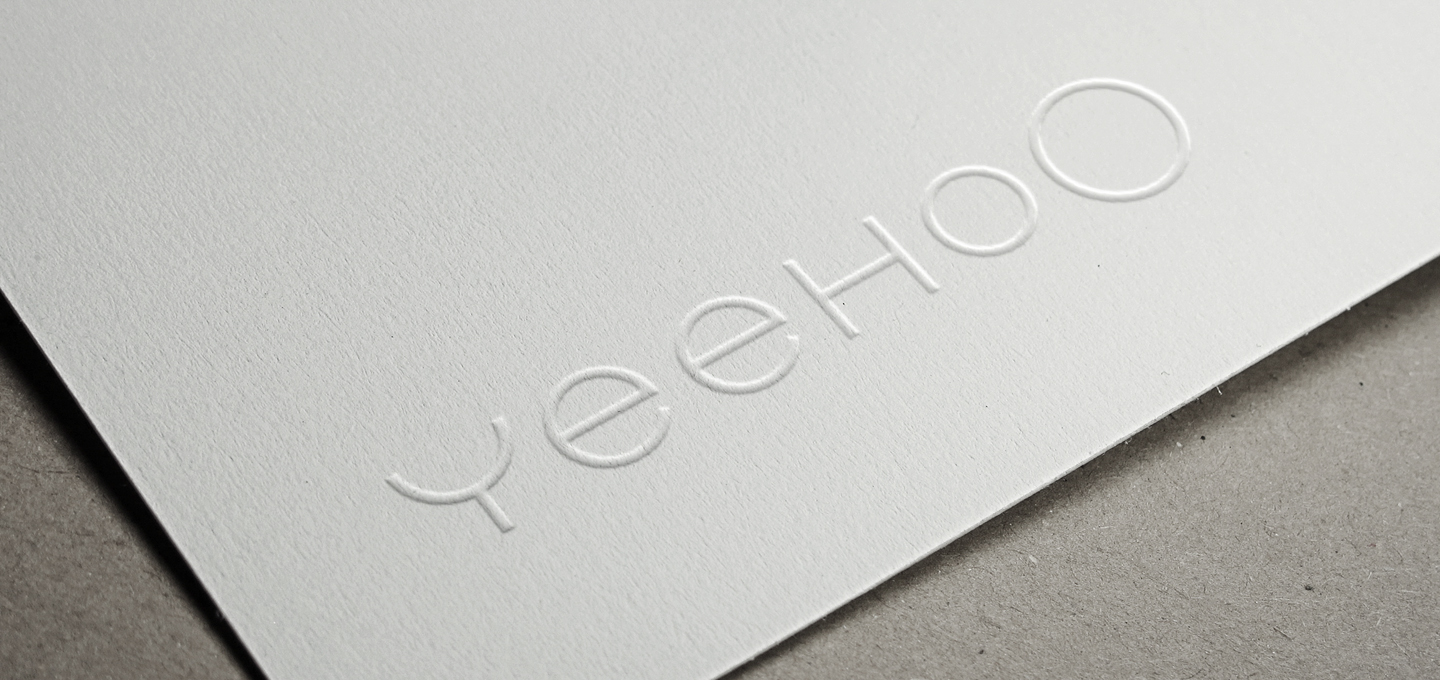
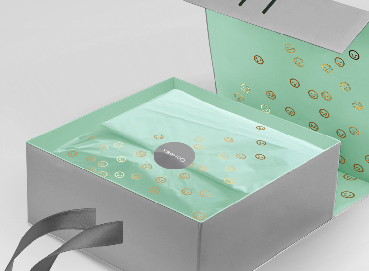
BETC Design was inspired by the brand’s English name Yeehoo, which mimics the first sound of a baby. BETC Design thus separated the English logo using a rounded font while writing the second letter ‘O’ in capital size, as to illustrate the melodic aspect of the brand name and concept, a metaphor of a baby learning how to speak. To enrich the brand’s visual identity, BETC Design developed the two symbolic O’s into a series of ‘baby emojis’, which illustrates the baby’s lively, innocent expressions, and to be applied to the brand’s graphic universe and products.
The purity and happiness of childhood is now palpable, as is the endless love and care of the parents in YeehoO’s world.
Yeehoo keeps on researching and releasing new products and services for children, progressing, innovating and exploring to maintain its iconic brand status on the market.