«To see
a world in
a grain of sand »
How to find the balance between ‘less is more’ and ‘the emotional link’ for a minimalist skin care brand?
Saselomo est la première marque de soin naturelle-bio chinoise. En s’appuyant sur une technologie moderne, elle hérite de l’intelligence de la nature, et permet de transmettre une philosophie de soin aux plantes, qui soit à la fois sûre, naturelle et efficace.
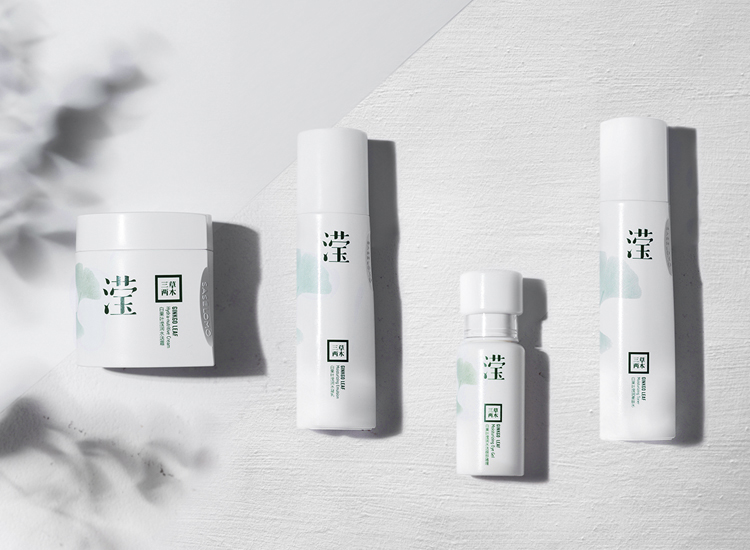
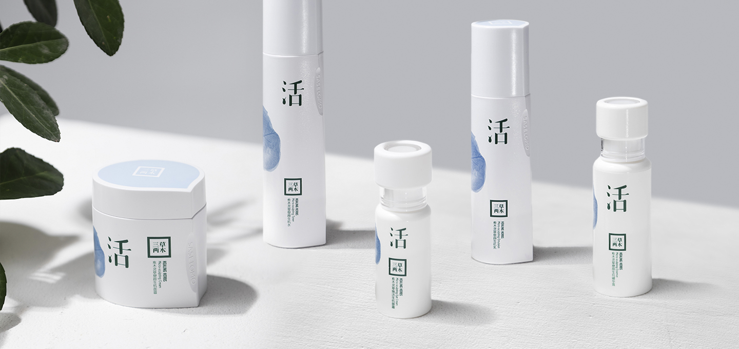
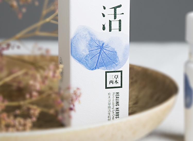
Saselomo is the first natural-bio skin care brand in China, through modern technology, il heritages the nature’s itelligence, pursues a sane, natural, efficient herbal skin care philosophy. The brand is sinsere, mild, and a nature lover, every packaging is produced by eco-friendly materiaux. But the brand story does not have a focus point, it tells about nature, budda, philosophy, life style, and science, lacks a precise brand positioning and differentiation with competitors. Also, its brand packaging concept is ‘one word one world’, to give every range a specifique Chinese character to describe the fonction, which is original, simple, and pure. But the white color tone makes the products too neutral, pale, cold and have a distance, especially in retail display is not attractive enough.
Our strategy is to first simplify brand story, reinforce the nature and the respect to the eco system. Then take respect as the main brand value, which is linked with 4 main aspects: sane, eco-friendly, immaculate, and sincere, and to keep the original ‘one word one world’ design concept, and its reliable, pure personality, add more feminity, color, and a poetic vivid touch.
Though the new illustration for the packaging, a new world can be seen from those micro vision of plantes’ details.
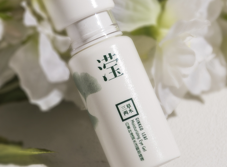
Also, its brand packaging concept is ‘one word one world’, to give every range a specifique Chinese character to describe the fonction, which is original, simple,and pure.