« One blazon
for a thousand
stories »
How to modernize the outdated vision of luxury associated to a traditional spirits brand?
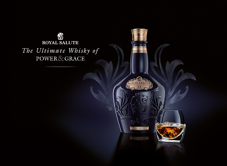
Royal Salute regains its nobility with BETC Design. Royal Salute saw the day during Queen Elizabeth II’s crowing. This 21-year-old whisky is the British court’s official whisky and owes its name to the cannon blasts fired in honor of the Queen.
To remain modern despite its 62 years of existence, this royal emblem entrusted BETC Design with the task to rejuvenate its image and to position the brand in the “modern luxury” segment.
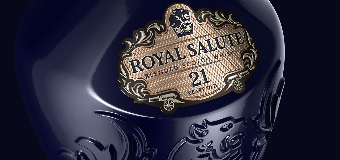
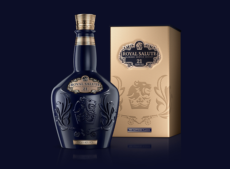
The graphic codes decorating the bottle, symbols of the British monarchy, were revisited and made more iconic. The smoking cannons draw an elegant shield framing a majestic lion overhanging the royal crown. Strong signs thus engraved on the porcelain, either colored in sapphire blue, emerald green or ruby red, as a wink to the crown’s jewels.
The bottle, now more slander and masculine, is topped by an engraved golden cap looking like the work of a goldsmith, which is itself headed by a stamping similar to a royal medal, hence reinforcing the nobility of the bottle.
This attention to detail is strengthened by a guillochage which dresses the box and that can be found as an ornament of the ring and on the label background, whose shades of pink and white confer the brand its premium feel.
This new carafe is a synonym of excellence, conveying the values of power and grace of an exceptional whisky.
This new carafe is a synonym of excellence, conveying the values of power and grace of an exceptional whisky.