« We made Badoit
the champagne of water »
How to upgrade brand image and gain status branching off from usual food category codes?
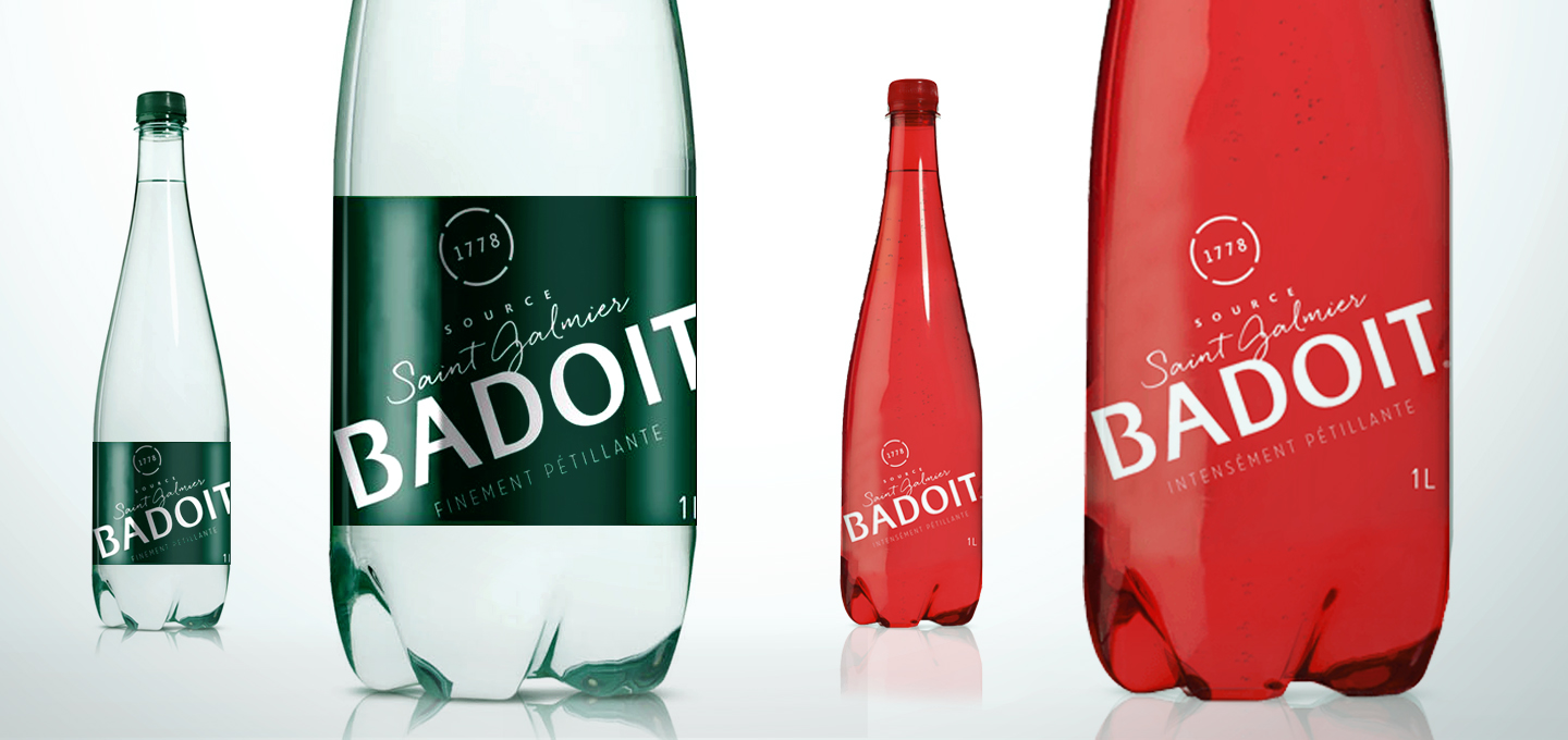
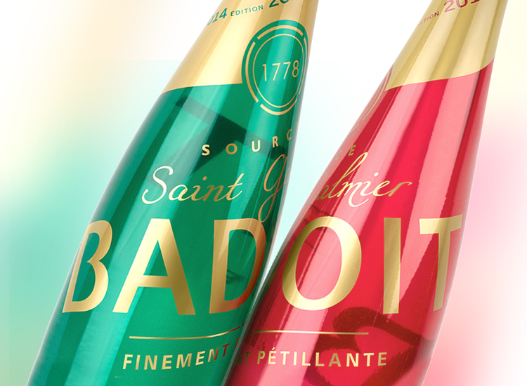
Restoring status and modernity to a patrimonial brand that combines authenticity (Saint Galmier Spring, since 1778, gastronomic) and hedonism (bubbly, light and joyful). Iconic codes of Badoit
were singled out and ordered. Graphic design was essentialized, branching off from usual food category codes, highlighting premium features drawn from both past and modern ancho-rages. The spring origins were put forward as well as the brand creation date framed in the manner of a seal. Green and red color was made iconic and Badoit typeface was simplified to increase in elegance.
New visual identity is a statement made to distinction and sobriety.
“ A meal is insipid unless it is seasoned with a touch of madness ”
ERASME